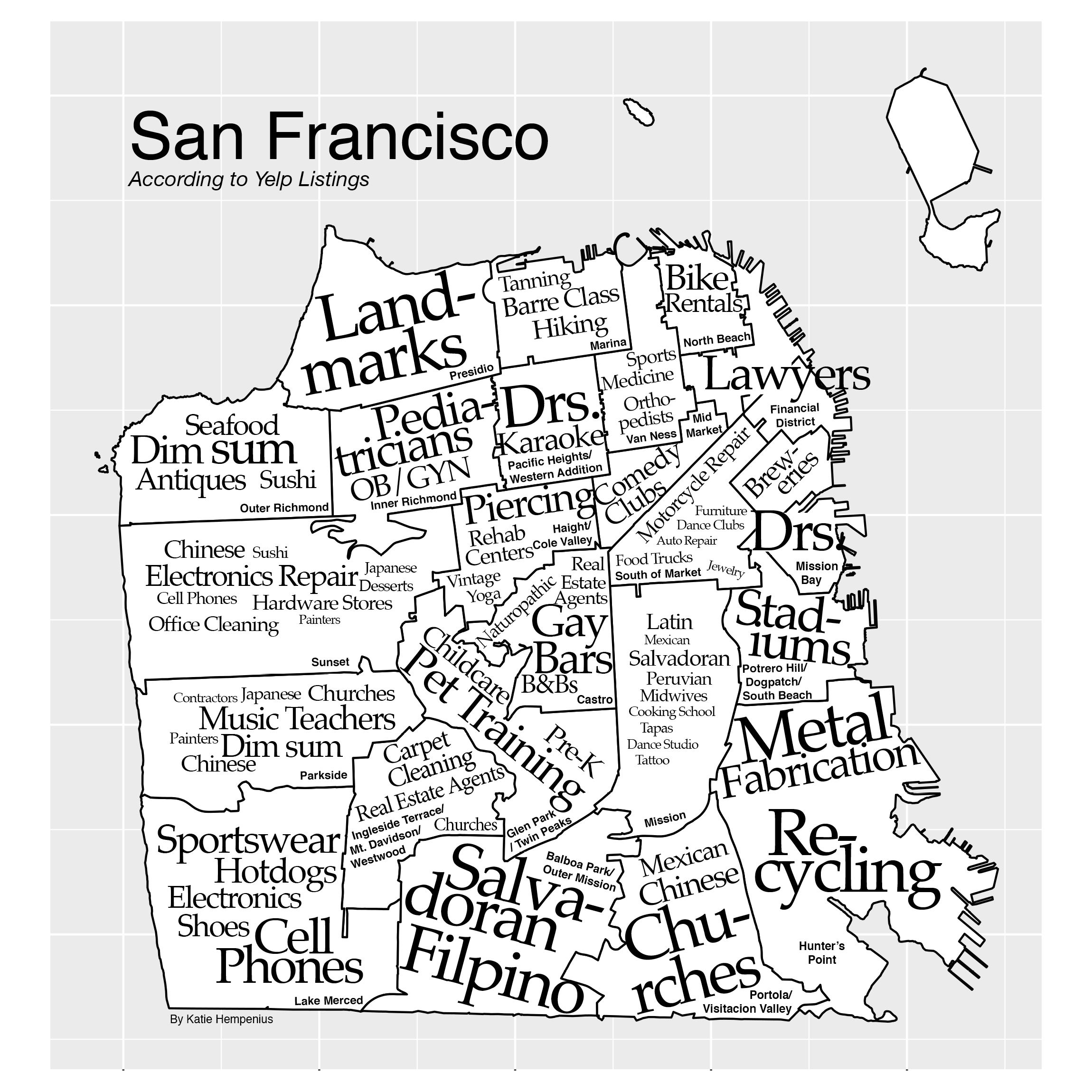
A Map of San Francisco, According to 30,000 Yelp Listings
Aug 18, 2016
How was this map created?
I collected data from San Francisco’s ~30,000 Yelp listings and used this information to identify the category(s) of businesses that are unusually prevalent in each zip code. These categories are displayed on the map and their font size indicates how disproportionately common a category is within a given zip code.
A Longer Explanation
Introduction
I was curious about the demography of the businesses that make up San Francisco, so I wrote some scripts to collect this data from Yelp listings. This effort yielded me a dataset of 30,000 businesses within San Francisco’s city limits.
While exploring the data I began to wonder whether the quirks (as well as the stereotypes) of San Francisco’s different neighborhoods would be reflected in this data. In other words, how would Yelp data characterize each neighborhood (zip code)?
Analysis
My goal for analyzing the data was to identify what makes a neighborhood interesting, not just what it has a lot of. (Although, if you’re curious, the answer to that is probably “Coffee Shops” or “Real Estate Agents”.)
Additionally, I wanted to do so in a manner that wouldn’t choke when handling the huge variations in population and business density across the city - mostly due to areas being commercial versus residential.
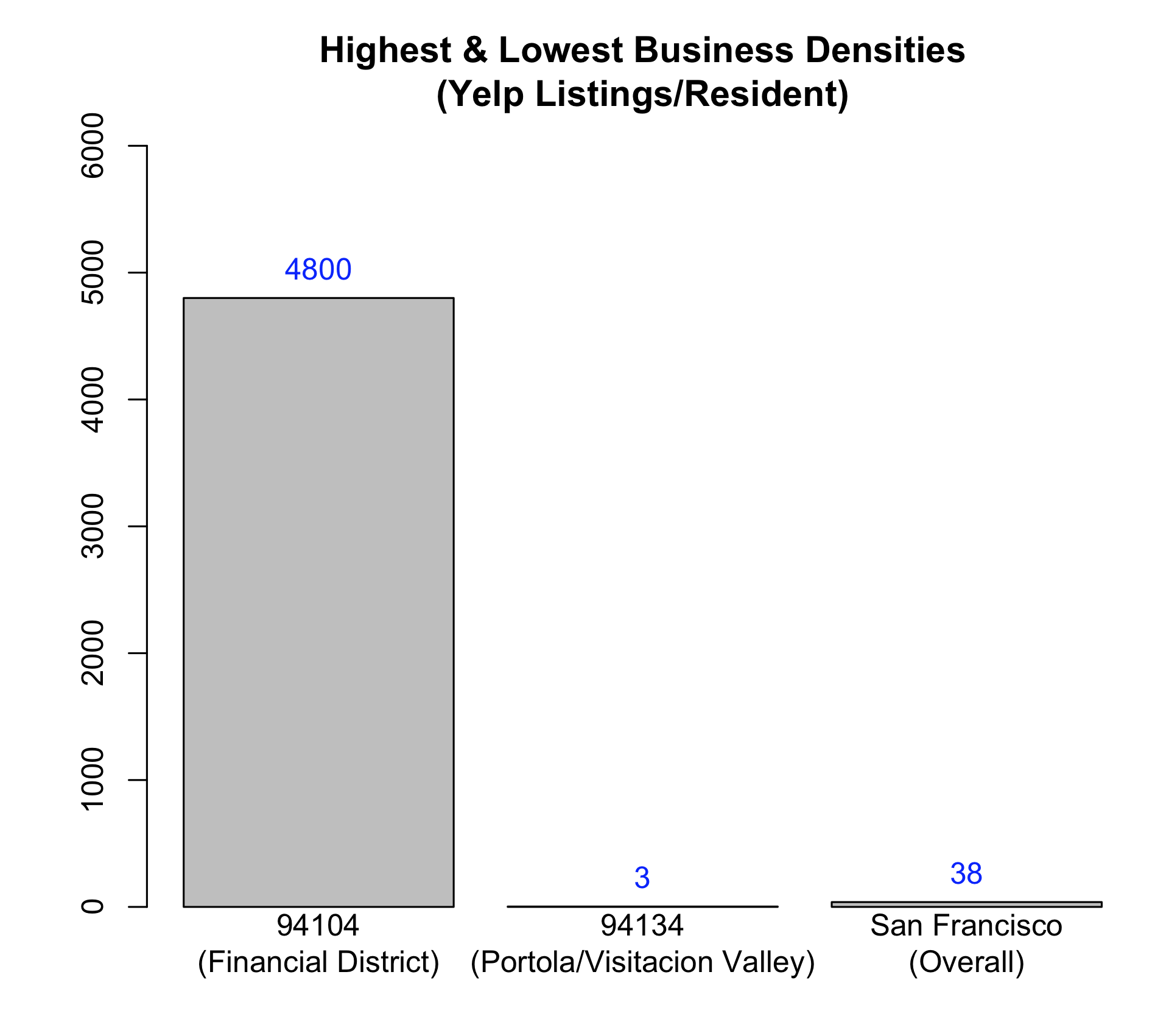
(The 94104 zip code, which is located in the Financial District, is home to ~1000 Yelp listings but only 211 residents.)
Based on these goals (1. identify interesting trends, 2. normalize for the effects of commercial versus residential usage) I decided to use the incidence rate (with respect to businesses) of a business category in a given zip code as my metric. I would be calculating this for each of the ~800 categories that Yelp has defined for US listings.
# Incidence Ratio

    Category Z in zip    Businesses in city
X = ------------------ * ----------------------
    Category Z in city   Businesses in zip
I arrived at this by supposing that if a city were perfectly boring, different zip codes would have different quantities of a particular type of business (e.g. “pizza parlors”) due to differences in their square mileage, zoning, etc. - however, the percentage of businesses that are of a particular category should be roughly constant across different neighborhoods (i.e. 2 pizza parlors for every 100 businesses). In other words, businesses of a particular type should be uniformly distributed with respect to overall businesses.
# If zip codes are homogenous, this proportion will hold true.

Category Z in zip    Businesses in zip
------------------ = -----------------
Category Z in city   Businesses in city
I calculated this incidence ratio for each Yelp category in each zip code. There are 27 San Francisco zip codes and ~800 categories used by Yelp, so this yielded about 20,000 individual incidence ratios.
Mapping
After omitting categories with small sample sizes, I selected the highest scoring categories for display on the map. If multiple categories had similar incidence ratios, I selected the category with the largest sample size.
# Before omitting small sample sizes
# 94102 - Union Square/Hayes Valley
   category        n_city n_zip rate
1  rv_dealers       1      1    11.765852
2  proctologist     1      1    11.765852
3  fencesgates      1      1    11.765852
4  pianobars        5      4     9.412681
5  comedyclubs     35     18     6.051009
6  historicaltours  6      3     5.882926
7  petadoption      4      2     5.882926
8  lebanese         2      1     5.882926
9  scandinavian     2      1     5.882926
10 videogamestores  2      1     5.882926
...
# After omitting small sample sizes
# (Results) 94102 - Union Square/Hayes Valley
  category    n_city n_zip rate
1 comedyclubs  35    18    6.051009
2 opera        21     9    5.042508
3 hostels      22     7    3.743680
4 carrental    60    15    2.941463
5 hotels      356    87    2.875363
...
The font size of a category on the map is directly proportional to its incidence ratio. The smallest text on the map represents a business category that is approximately 2.5x more prevalent in that zip code than would be expected, while the largest text represents a business category that is 15x or more prevalent than would be expected (I capped font sizes for the sake of readability).
How was this made?
This was created using the Yelp API, Mongo, and R. Graphics were made in R and InDesign.